Showing posts with label goodwill finds. Show all posts

Sunday, September 18, 2011

INSECT JAR - TRIAL RUN #1

  Before the girls arrive for a night of creepy creativity, I thought it would be a good idea to have a trial run.   So, first of all, here is another look at my model right out of the October issue of Country Living Magazine:


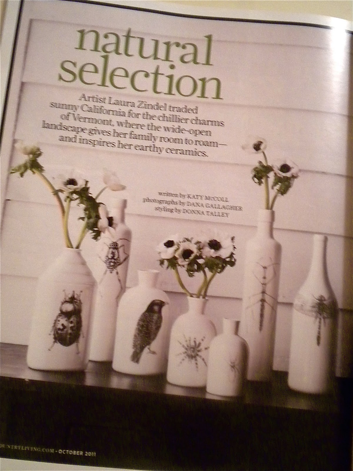
 I tried out a "Spider Jar" using a clear glass bottle with a clear glass stopper.  This is the perfect jar for this project and it came from Goodwill for only $1.99.   This jar is about 12" tall and 5" wide.
 I want to try doing this project two ways - painting the inside for one piece, and the outside of another. Tonight I'm working on one that is clear glass, so it will be painted on the inside.  It's a perfect jar for this because the stopper is partially hollow.  If it was solid glass you''d have nowhere to put the paint but on the outside.  Remember to check for that when you're out looking.  I've often thought that a certain cake plate or candy jar would be good, but the stem would never get any "inside" paint.
 So I put several tablespoons of white acrylic paint in the jar, added about the same amount of water, and blended it all with a long brush.  Then, I rolled the jar around in my hand to cover the whole inside.  You may need two coats depending on how much water you use.  I think one coat will do for mine.
Then, do the same thing with the stopper.  Any paint that gets on the outside of the stopper or jar can be washed off after it dries.

Then for the spider graphic!  I got this great taratula off the Graphics Fairy here


  I sent it to the printer after decreasing the size a bit.  As you can see above, 100% it was WAY too big - it filled the page and my jar isn't that big.


But, 60% was just right.


Then, cut it out as close to the hairy legs as possible, since you don't want too much of the white printer paper to be showing. 


Ideally, none would show, but good luck with that!   Then I attached the spider to the jar using an Elmers Glue Stick.

So, after spraying with gloss polyurethane, it goes under a cloche for now.  I'll wait until the inside is completely dry to put the lid on.

I can't wait to add more, but right now, I hear Norma calling!

Sharing this on the
and
White Wednesday
and
The Lettered Cottage


Tuesday, July 12, 2011

TRUMEAU MIRROR

"I'm glad I took a before picture of this project - I just wish I'd used my camera instead of my phone!  But at least you can get an idea of what it looked like "before".  This is a mirror I found at Goodwill, and by their standards, this was expensive!!!  I believe I paid $9.99 for it.  It is very heavy and solid wood.  
 I had seen a Trumeau Mirror on the Graphics Fairy a few weeks ago.  Before that, I had never heard of them.  I love to know the history behind the things I make, so I looked them up and here's what I found: 
"The trumeau mirror originated in France during the 18th century and are as popular today as they were then.  Trumeau mirrors were intended to hang on the wall between windows providing a decorative element to the wall as well as serve a purpose of bringing in more light.  Most antique trumeau mirrors are found painted, as the style of most homes during the 18th century homes were painted in rich faux work with ornate plaster frieze that ornamented the walls.
The trumeau mirror is quite easy to identify, as it is most often rectangular in design. The size of the mirror was dependant on the size of the mantle or the width of the wall on which the trumeau hung.  Trumeau mirrors are designed where the bottom portion is the mirror itself, while the top is generally decorative.   The lower portion of a trumeau is always a mirror, and placed behind a candle and served the purpose of bringing in more light in dimly lit homes.  Homes were not wired for electricity, so any way of bringing in light which extended the hours of  daylight was a necessity.  The upper portion of a trumeau contains a relief carved design, a painting, or a second mirror."
So here is the top portion of my mirror.  No decorative plaster, but still, an area just waiting for some decorative painting.  I planned on adding some gold to the mirror and that little decorative strip below the blank portion looked perfect for that.  So, back to the Graphics Fairy to find a design and I found this, a black and white printer's image.  I was only able to use a portion of the graphic due to the size of the space I had to work with.  Also, I took the wings off the cherubs.  I used the "pencil lead on the back of the paper" method!  
 Then I used some of this metallic finish on a decorative piece of wood that runs below the design and on some of the other raised areas on the mirror.
 There are a lot of metallic finishes out there - this one just goes on with a brush or rag.  
It's keeping my Santos Cage Doll company in the dining room!

-Nan


Sharing this at BRAG MONDAY on The Graphics Fairy
and
Tuesday's Treasures

Wednesday, July 6, 2011

A FEW MORE TOUCHES ON THE PINK GUEST ROOM

A very dear friend is coming to visit in a week, and the pink guest room is her room when she's here.  Jan comes to Wisconsin every July to get away from the Texas heat for a few days.  (Remember the McKinney posts from last winter?  That's where I head in February to get away from our snow and cold!)  Well, this room used to have two twin beds and now has a queen, so the lighting needed to change.  So, I went to Goodwill and found two lamps that are similar.  They're close enough for me, and they were only $3.99 each!  You can't beat that!  I bet that "tole painting" looked great in the 80s!
The pattern on the lamps would have to go, and I've read that, as well as working for exterior pieces,  Annie Sloan Chalk Paint can stick to practically everything, so I gave it a shot.  


 Drying . . . it looks a little shiny because it's still slightly wet.  It dries very quickly though and I painted outside on a breezy day, so it kind of globbed up a bit.  But then, the wax . . .
Not too much difference - the left one has wax and the right one doesn't have it yet.  It just gives the base a warmer color and a little sheen.  I actually like the way the paint "globbing" a bit gave the surface a nubbly look - kind of like plaster.
Add two $7 shades from Target - and for $22 I have two great lamps for the guest room!
The difference in the height of the lamps is solved with a couple books under the shorter one.  I'm still thinking about doing something from the Graphics Fairy on the lamps.  Too plain?
All ready for Jan's visit!  
(You see the lamp on the right though?  The darker part of the base near the top??  THAT is going to bug me and I'll have to paint it too.)

Two lamps - going from this                             . . . to this, for only $22!

Isn't Goodwill grand?!?!

-Nan

Sunday, June 19, 2011

Saturday Chair Project - After

Here's how I went from:
   
                             this                               to this  
for only $4.95!

The chair project from yesterday is finally done.   A few notes . . .
 I used a hot, dry iron for the Paris postmark from the Graphics Fairy.  Just as the video says, you can't over-iron.  If you have to tug at all to lift the transfer paper off the fabric, iron some more!
When it's transferred, it easily peels off.  But, you see the transfer paper around the letters?  :(  
 I found that after washing and drying the fabric, the excess transfer paper dissolved a little more.  At least it isn't shiny - that's the good thing!  And maybe after enough people sit in the chair, it'll blend in even more!
There she sits, stripped down to her underwear!  And then the fun part - painting and distressing.


From this . . .
to this!

Now, here's what I did and some comments on what I should have done! 

What I did:  I printed out the graphics fairy Paris postmark onto Transfer Artist Paper (TAP) and cut loosely around the design, then ironed it on.  It transferred very quickly!  I bet I only ironed with a hot, dry iron for about 10 seconds and it was transferred!  

What I should have done:  I should have cut as close as possible to the graphic printout before ironing it on the linen.  It looks fine and I bet I'm the only one who could tell the difference, but the little bit of transfer paper I left around the design didn't completely disappear.  So, take the time to really cut it closely.

and

What I did:  I took the chair into the garage and went full blast with my palm sander.  I mean, full blast!

What I should have done:  Maybe start out with a piece of sandpaper in my hand and take it slow and easy.  It doesn't look too distressed in the photo, but in real life . . . it's pretty distressed.  You can always take more off . . .   So, I ended up retouching the REALLY distressed areas with a little paint.

But, it's done and I really do like it . . . but it's kind of like going to someone's house for dinner.  It always tastes better when someone else cooks.  Well, if I saw this chair in a store I'd REALLY love it, but I know where all the little glitches are . . .

-Nan

Sharing this at:
Brambleberry Cottage
Graphics Fairy
Creative Blogger's Party

Saturday, June 18, 2011

Saturday Chair Project - Before

 I found this chair at Goodwill last week for $4.99!  There were also two side chairs, but I only wanted the one with the arms.  So, today is the day to fix it up. 

 Yes. 
$4.99!  
Someone had torn off the "sold" tag, and then changed their mind.  
I've lucked out like that before.  
What were they thinking???  It's $5!!!
 It has great cutwork and curvy details.  
There are no missing pieces, cracks, or chips!
 Beautiful arms -
 and great details on the legs.
  The seat is in good condition - the whole thing just needs 
some paint, and a new seat cover.  
For the new cover, I'm using off-white linen with a really great nubby texture.  Make sure you prewash and dry your fabric to get all the sizing out and allow any shrinkage to occur.  The washing and drying of the fabric also allows the "nubs" of the linen to come out more, and if the sizing is still in the fabric, the transfer won't adhere as well.


vintage french letter clip art
I'm also using this beautiful Paris postmark graphic from The Graphics Fairy.  The Graphics Fairy states, "The letter is addressed to Madame Sugat? Sugart? in Paris and was sent from Boulogne, as you can see by the postmark.  This wonderful ephemera image dates to the 1830s."  
I wish I knew more about Madame Sugat!  Little did her friend know that his/her handwriting would end up on a chair in Wisconsin!
Oh, and don't forget to reverse the image of any script before printing!

To transfer the graphic, I'm going to try TAP (Transfer Artist Paper) that I found at Michaels.  There's a great video for it's uses here.  This is supposed to be the one iron-on transfer paper that doesn't leave a plastic-like sheen on your fabric.  It's also washable.  


We'll see.  

So, that's what my day holds.  Results will be posted tomorrow . . .

LinkWithin

Related Posts Plugin for WordPress, Blogger...